Pops on the River: Music of Motown
For many years, the Reno Philharmonic has hosted “Pops on the River,” a musical celebration of Reno’s creativity and passion for the arts and a longstanding tradition in our city. For the past four years, Design on Edge has had the privilege of developing the creative direction for Pops. This year, the Reno Phil landed on the theme, “Dancing in the Streets: The Music of Motown.” From 1961 to 1971, Motown was renowned for its excellence and impact on the music industry. Many of its artists signed to Motown Records, gained mainstream success, and are still renowned as influential artists.
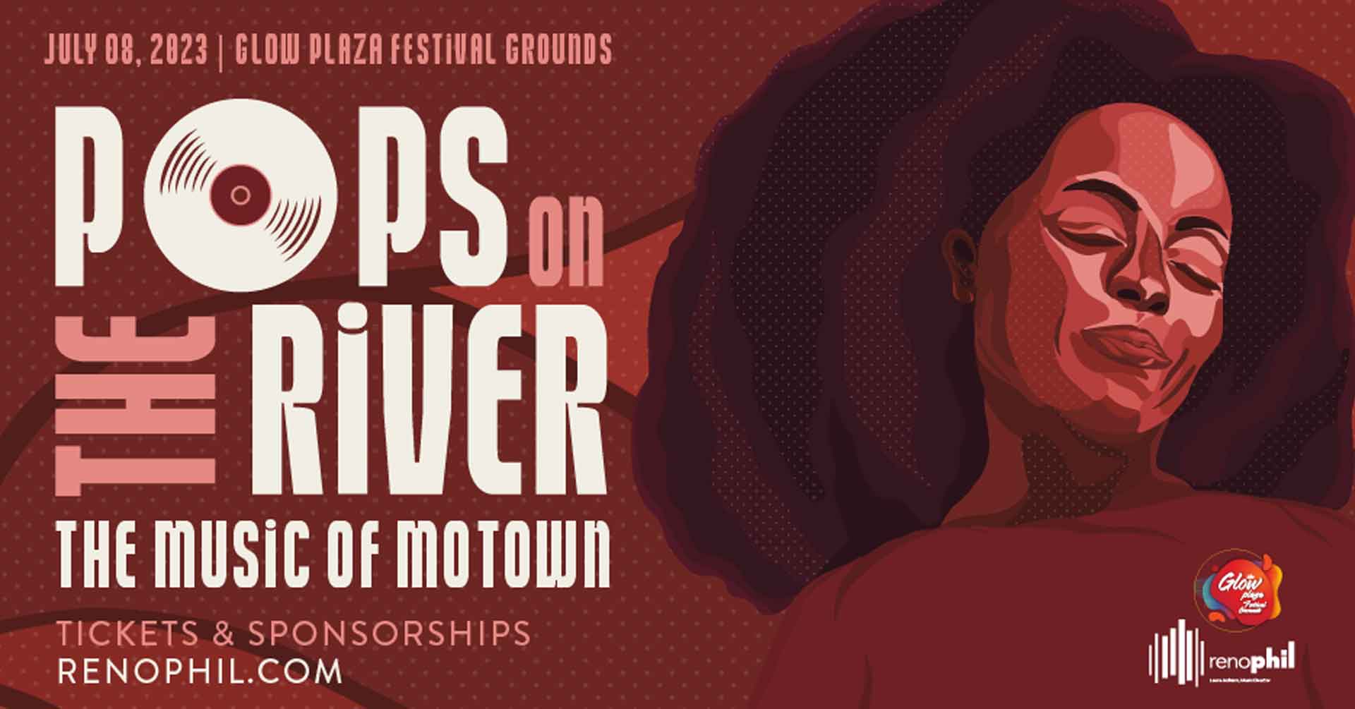
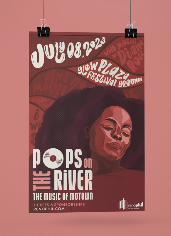
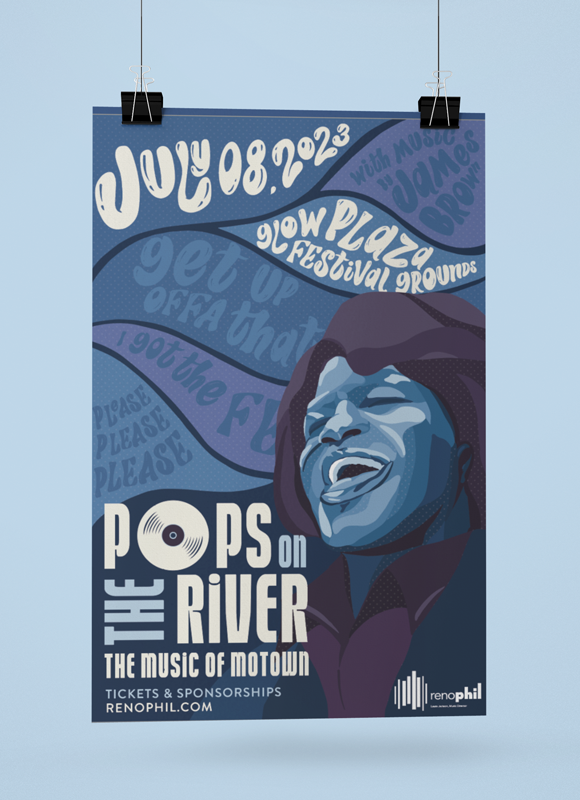
As we developed the creative direction, we initially wanted to create posters reminiscent of the posters designed for the Motortown Revues, a touring lineup of Motown’s most prominent artists. However, we felt that we could do more to pay tribute to the defining names of Motown, specifically James Brown, Diana Ross, Jackson Five, The Temptations, The Supremes, and Smokey Robinson & the Miracles.
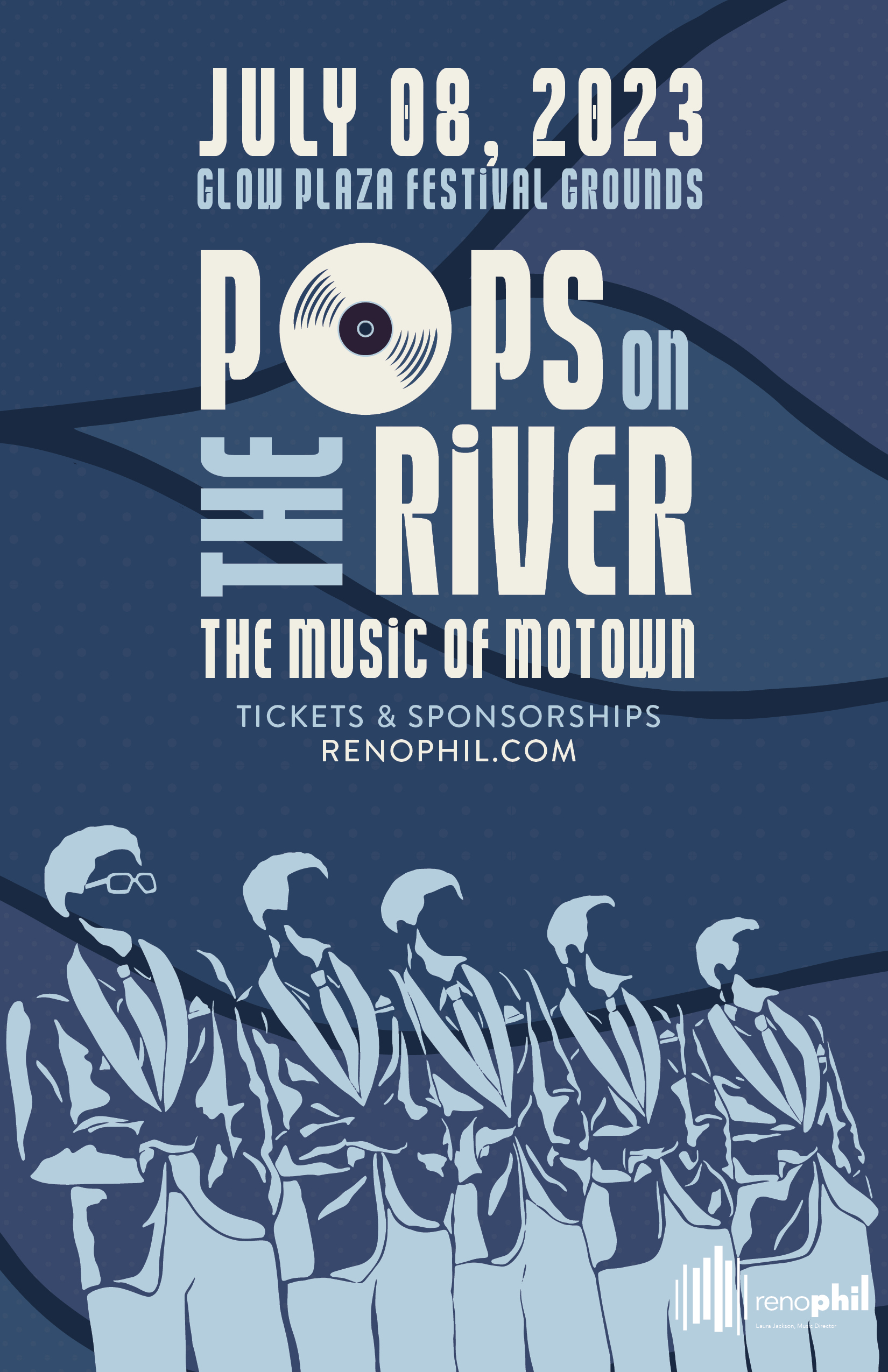
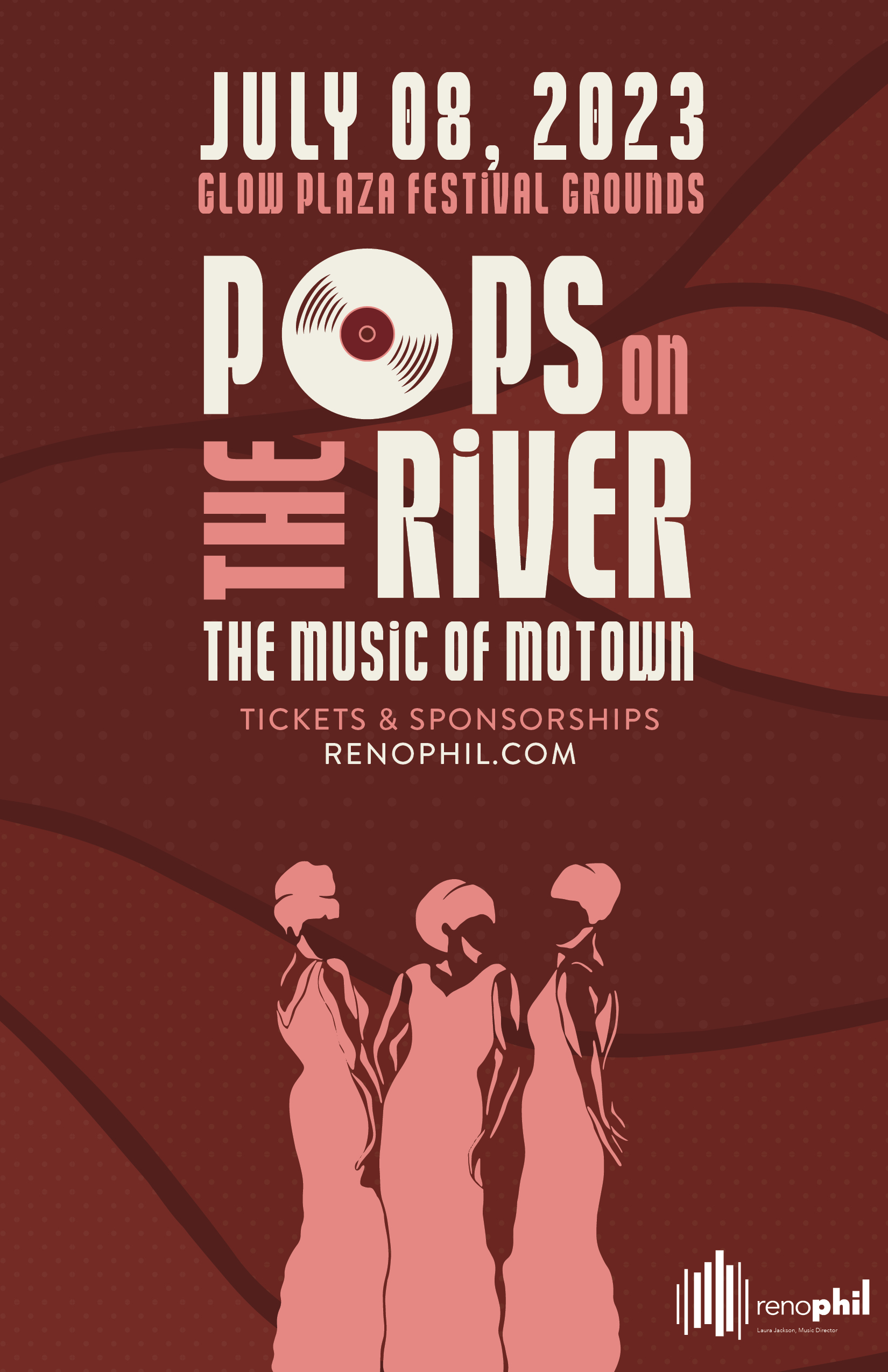
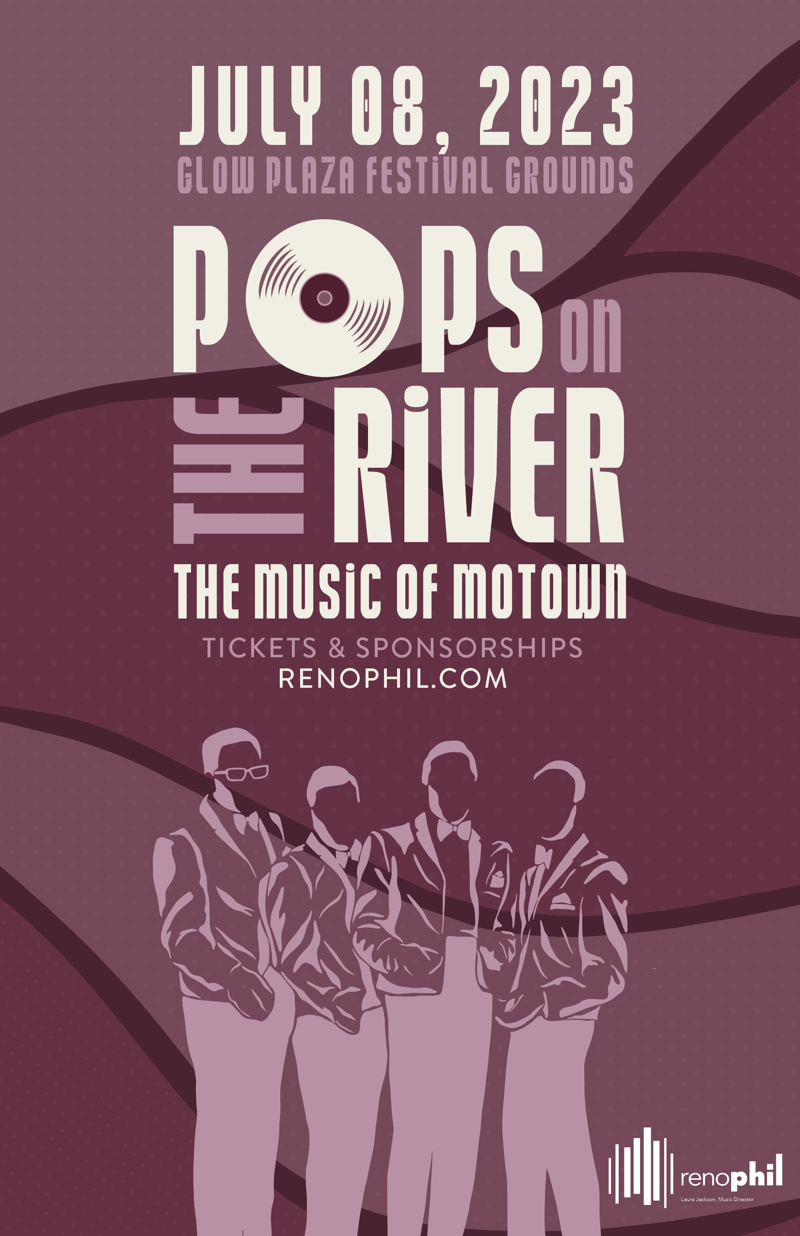
Inspired by Motown’s roots in pop, soul, R&B, gospel, and soul music, we developed an analogous color palette consisting of deep reds, blues, and purples as we felt that they evoked similar emotions typically associated with those genres: earthy expressiveness, passionate romanticism, and sensuality. With those emotions and colors in mind, we illustrated two sets of posters: a set of portraits and a set of silhouettes. The images portrayed through illustration included James Brown, Diana Ross, and the Jackson Five. The backgrounds of those posters also featured uniquely lettered names of songs from the artist highlighted. The second set of posters included illustrated silhouettes of The Temptations, The Supremes, and Smokey Robinson & the Miracles to showcase more of the groups that reached success with Motown Records.
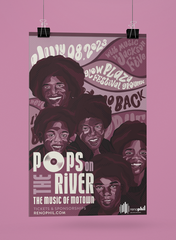
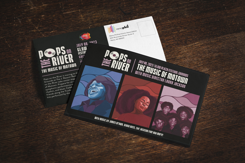
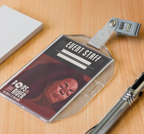
In keeping with the theme of Motown, we also needed to update the “Pops on the River” logo. We needed to find a typeface or lettering style that would seamlessly complement the existing artwork yet was still unique enough to draw the viewer’s attention. We played with various lettering styles until we landed on StreetSign Sans, a typeface inspired by 80s-90s Vietnamese hand-painted billboards. This typeface is brimming with personality and quirks, so it is the perfect fit for our posters. Our client also requested that the posters include a vinyl record in the artwork to pay tribute to the Motown Records label. Our solution was to incorporate the form of the record into the final “Pops on the River” logo so that regardless of where the logo was being used, it would continue to pay homage to the origin of Motown music.
Ultimately, we here at Design on Edge are committed to doing good for our community. Every year, we are honored to continue our partnership with Reno Philharmonic to combine our creative forces and curate an experience that uplifts and celebrates the creative community of Reno.