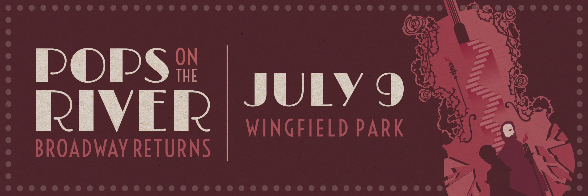
2022 Pops on the River: Broadway Returns
As the date for “Pops on the River: The Music of Motown” approaches, we’re reminiscing on 2022’s “Pops on the River: Broadway Returns.”
For many years, the Reno Philharmonic has hosted “Pops on the River,” a musical celebration of Reno’s creativity and passion for the arts and a longstanding tradition in our city. For the past four years, Design on Edge has had the privilege of developing the creative direction for Pops. With the return of energy toward live performances in 2022, our goal was to create a dynamic theme encapsulating all of the iconic shows Broadway offers and the Reno Phil’s musical tribute.
The ideas are endless when you think of the visual impact Broadway evokes. My favorite musical is Sweeney Todd, yours is Hamilton, and theirs is Hairspray. Now how do you combine everyone’s favorite Broadway Shows into one poster to promote Reno Philharmonic’s biggest fundraising event of the year? You don’t; I tried. Collaborating with the Reno Phil’s 2022 Pops on the River setlist, we took some of Broadway’s most notable titles and illustrated a three-poster campaign, combining music, performance, and artistry.
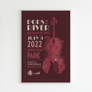
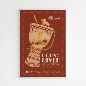
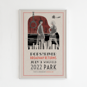
We paired these three titles with instruments used within their musical scores: The Phantom of the Opera, cello; The Lion King, djembe; and Chicago, piano. These instruments were also a direct representation of the Reno Philharmonic. To create a cohesive poster layout, we used typography reminiscent of playbills and bright Broadway lights to complete the final compositions. The result is a dimensional illustration giving you a peek into the music of Broadway.
Each poster comprises iconic imagery from the shows within their instrument silhouette. Our first poster shows the characters descending into the Phantom’s labyrinth. The complexity of their entanglement is signified through the roses weaved around the cello. The shattered glass represents the Phantom’s battles. On one side is his love Christine, and on the other is his struggle with self-acceptance. The use of maroon and dark pink tones contributes to the melancholy theme of The Phantom of the Opera.
If Lion King taught me one thing, it was to show pride in myself, my family, and my surroundings. In our second poster, we used a tilted djembe to stage the iconic scene where Simba is presented to the animals at Pride Rock. Rust, red, and orange tones associated with sunsets and grasslands were used to build this scene of African wildlife.
It would have been a crime if we didn’t include Chicago in our poster lineup. You can’t have jazz without a swingin’ piano, so we used this instrument as our initial setting, using negative space to build Chicago’s skyline within the keys. The leading ladies are shown towering above Chicago confidently toward the limelight, and the scene from “Cellblock Tango” is dimly lit behind them.
![]()
![]()
Each of these posters, in unison, represents the relationship between performance and music. Our solid creative direction adapted this campaign into various digital and collateral forms used across Reno Philharmonic platforms, a kinetic poster design, event program design, digital ads, direct mail, print advertisements, promotional items, and staff passes.
We are committed to doing good for our community at Design on Edge. Every year we are honored to continue our partnership with the Reno Philharmonic to combine our creativity to promote an experience supporting Reno’s arts. In 2022, our dedication to this project gained us two gold regional Addys in the poster campaign, one gold Addy in the illustration series, one silver Addy in the illustration series from the American Advertising Association, and a 2021 Ace award for best illustration from the American Marketing Association.