The Love & Culture Behind India Kabab & Cury
We know we’ve done good work at our agency when it leads to more exciting work! After our success with our client, Cluckers, we were referred to their neighbor just down the road, India Kabab & Curry, an Indian restaurant that’s been in the heart of Midtown for over 20 years (and has been voted Best Indian Food in Reno for those 20 years).
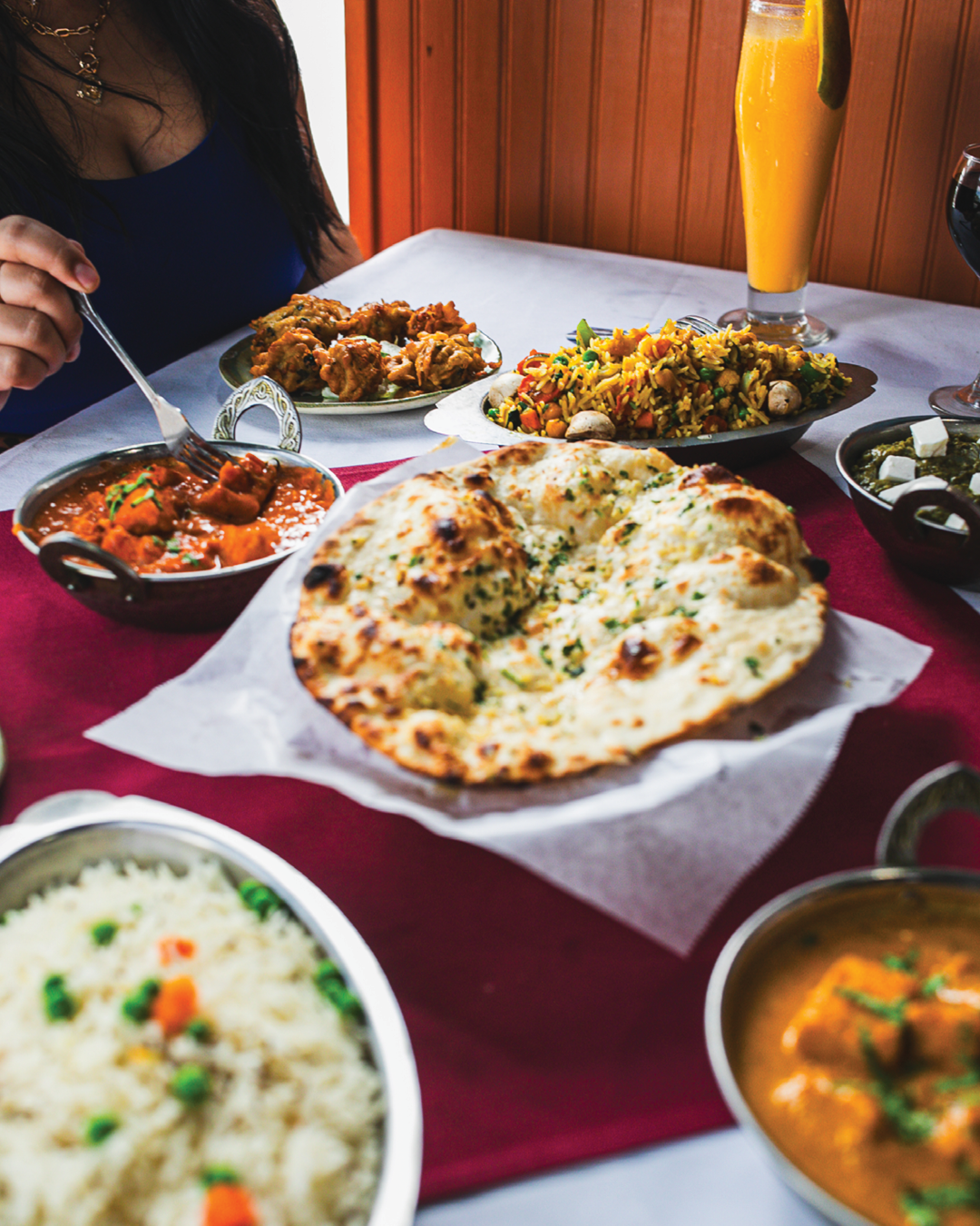
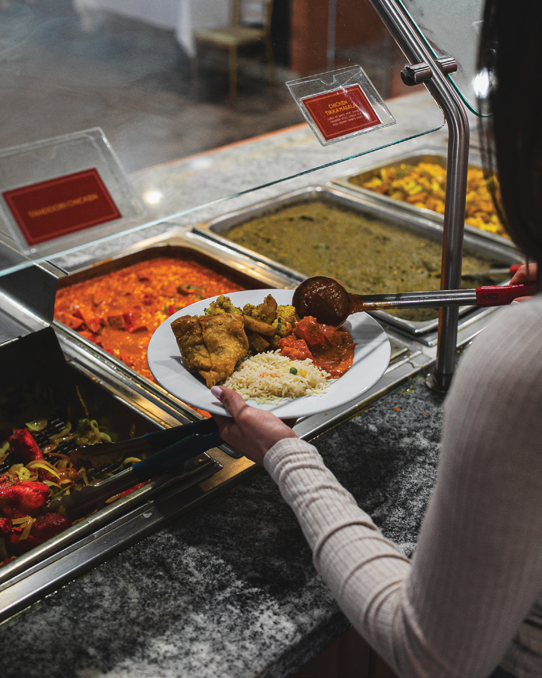
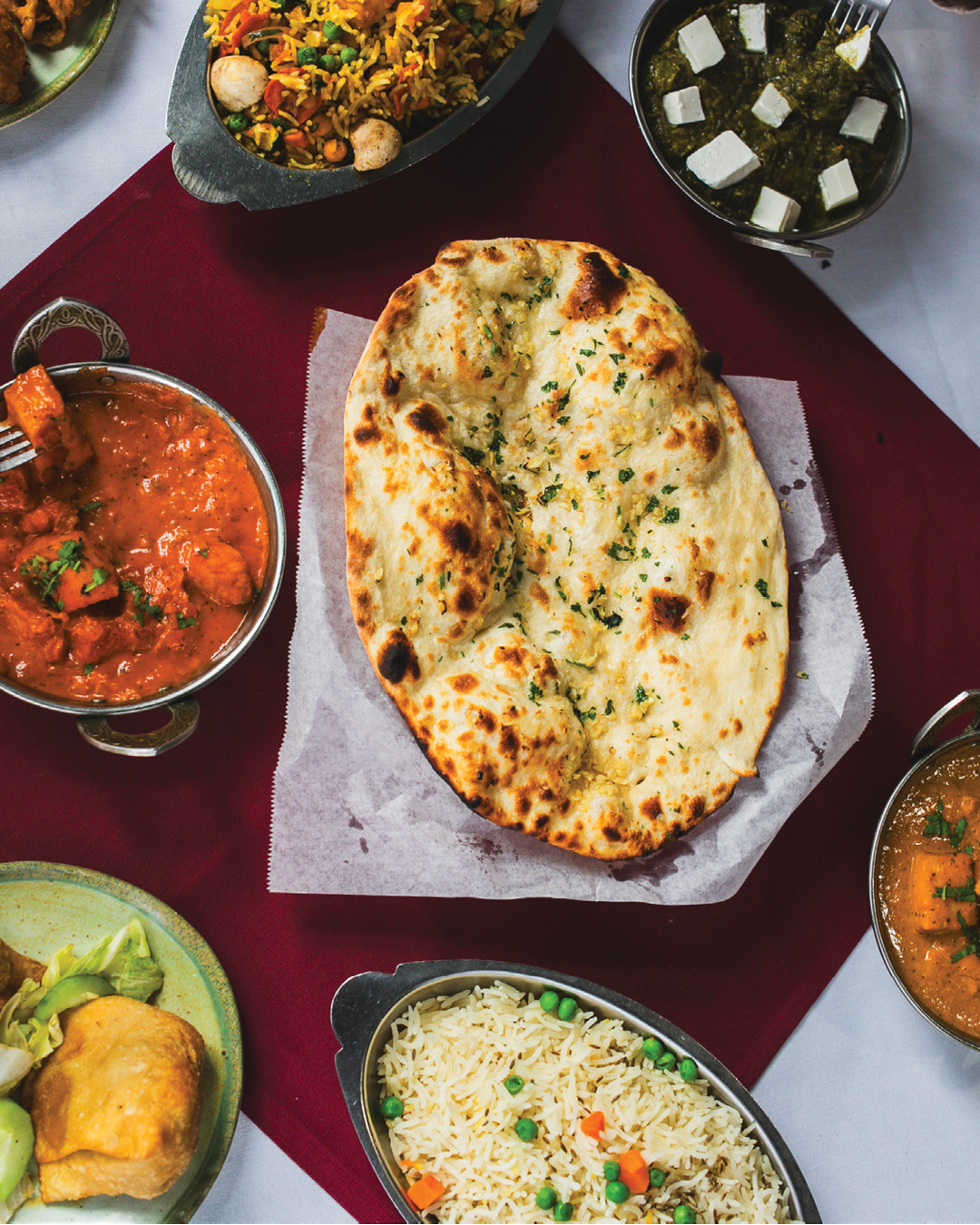
It’s been Reno’s favorite destination for authentic Indian cuisine for those craving the rich flavors, warm hospitality, and vibrant traditions of India. With their affordable lunch buffet and delicious dinner entrées, it’s no wonder Reno-ites love heading there for client meetings, family dinners, or for a quick lunch bite.
India Kabab & Curry’s mission has always been to showcase its diverse culinary heritage, emphasizing the smoky goodness of tandoori kababs, the comforting flavors of traditional curries, and the crisp perfection of dosas, where every dish is made with quality ingredients, traditional recipes, and a touch of love. They also remain steadily committed to serving the Reno community as often as they can, by donating food and sharing their dishes at community events.
When we were referred to their team, their brand had a variety of typefaces, logos, and even websites that were just bits and pieces of who they really were. It was evident to us that what they needed most was a refresh to help their brand feel cohesive, authentic, and encompass who they truly are and the story they wanted to tell through their restaurant, because at the core of India Kabab & Curry is a love story. The owners met and fell in love when they were just young kids in India, had dreams of journeying to America, and made it their mission to honor that love and their culture through their restaurant.
Like many long-standing businesses, brands and logos can become fragmented over time, fonts get mixed, logo files go missing, colors get swapped, and before you know it, brand confusion sets in. What was once a well-known company is becoming unrecognizable, sending mixed messages, creating internal confusion, and losing its identity. With India Kabab, the owners’ commitment to quality and superior service never wavered, but the building itself displayed three different logo marks. Meanwhile, four separate companies had sold quick-and-easy SEO site builds to the owners without granting them real access to their domains or hosting. This led to unnecessary monthly fees, a fragmented client base, and incorrect menu listings. Needless to say, we had our work cut out for us. And so, when we began building their brand, our mission was the same: to honor their love and culture.
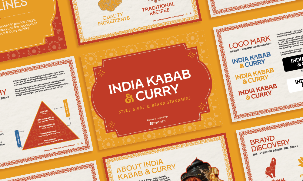
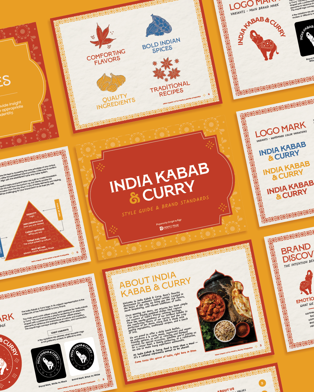
What made this brand build different from our usual process was that we were tasked with developing a logo and window vinyl designs before any other collateral or brand support. Through many revisions, the client landed on a design that showcased their commitment to comforting flavors, bold Indian spices, quality ingredients, and traditional recipes. Our team custom-illustrated spices that are essential to Indian cuisine: chilis, star anise, curry leaves, garlic, and cardamom, and developed a design that was modern, eye-catching, and yet still felt true to who they were at their core.
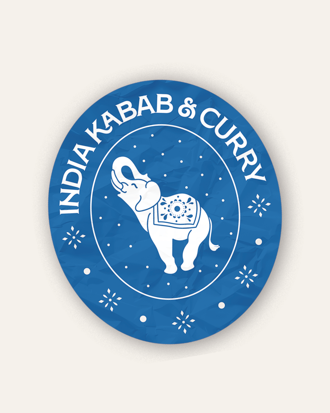
For their logo, we also assembled a variety of ideas into a strong brand mark: an elephant smiling with its trunk raised high, encased in a badge with a pattern that alludes to the bold, maximalist aesthetic of Indian culture. It was important for us to center the elephant, as it was a symbol consistently used across their socials, website, and restaurant. We also knew it was important to include elephants, as they hold great symbolism in Indian culture, often representing wisdom, power, and divinity. When the elephant raises its trunk, it becomes a favorable symbol of good fortune and prosperity.
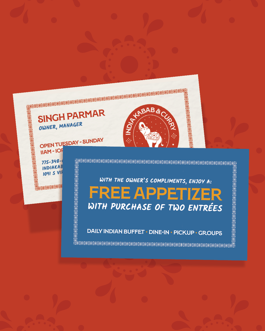
To complement the brand, we streamlined their existing site URLs and worked closely with their chosen partner to update colors, fonts, and the logo mark, helping keep client costs minimal. We created affordable management cards with an easy-to-track bounce-back offer, enabling owners to connect with customers and personally encourage repeat business.
Additionally, we redesigned signage for events and activation experiences, including outdoor tastings and samplings, bringing food and flavors directly to the community. New rack cards and easy-to-apply stickers for to-go bags, along with small offer cards placed inside take-out boxes, further enhanced the customer experience. We also developed marketing materials to cross-promote lunch and dinner customers, creating a system that boosts retention and encourages repeat visits.
Our approach provided a low-budget, cost-effective, and highly visible creative strategy for growth. The brand is now scalable, usable, and simplified. New photography, updated social media accounts, and fresh outreach efforts are the saffron on top of this flavorful dish and we’re excited to see it flourish.
This shows that a brand is more than just a logo; it’s a reimagining, sometimes an entire rebuild of how you communicate your message through color, visuals, and voice.
It is our sincere hope that, with their refreshed brand, India Kabab & Curry continues to enjoy good fortune and prosperity, and that this prosperity overflows to their loyal customers who cherish and celebrate their culture and food just as much as they do.