Building A Brighter Future with the Green Business National Network
For years, the Green Business National Network has operated with one core mission: to build relationships and share information and resources with like-minded green and sustainable business programs across the country. In promoting collaboration, these programs have the support and resources they need to grow, flourish, and better serve their respective communities.
As we began our partnership with our client, it was important that we aligned with their vision on this new chapter of their organization. It was clear that, even though their previous brand mark reflected their purpose as a network of resources, their team no longer felt excited about it; the mark felt outdated and simply didn’t align with the direction they wanted to move in. They wanted a brand that felt cohesive, modern, trustworthy, and professional, and, most importantly, a logo that told the story of where they’ve been, where they are, and where they’re going. Simply put, they wanted a brand that could make them feel both excited and inspired.
In developing their logo, we at Design on Edge strongly believed in avoiding AI due to its negative environmental impact. We wanted to build something authentically and intentionally, which meant diving deep into research to ensure that we’re representing the brand to its fullest potential. We imagined a mark that would leave a legacy, endure trends, and remain true to the heart and spirit of GBNN.
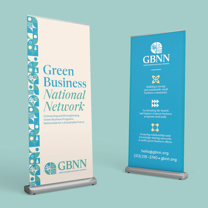
What came about was a brand mark that had three different aspects built into it to reflect the three key goals that they believe are best achieved through collaboration:
1. Building a strong and sustainable small business community. This is represented by the variety of buildings on a hill, showing the diversity of businesses that benefit from GBNN.
2. Accelerating the launch and impact of green business programs nationally. This is represented by the rendering of a sun because, like the sun, GBNN provides support that inspires life and growth among its members and, in turn, creates a greater, more sustainable impact for its communities and our world.
3. Fostering relationships and knowledge-sharing networks to unify green business efforts. This is represented by the river, because like the river, GBNN acts as a connection point to unify its members and continues to bring resources to the communities and programs that need it the most.
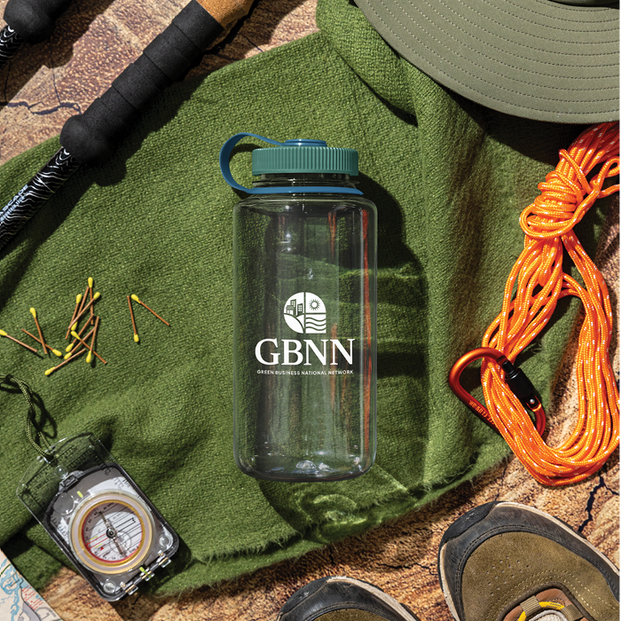
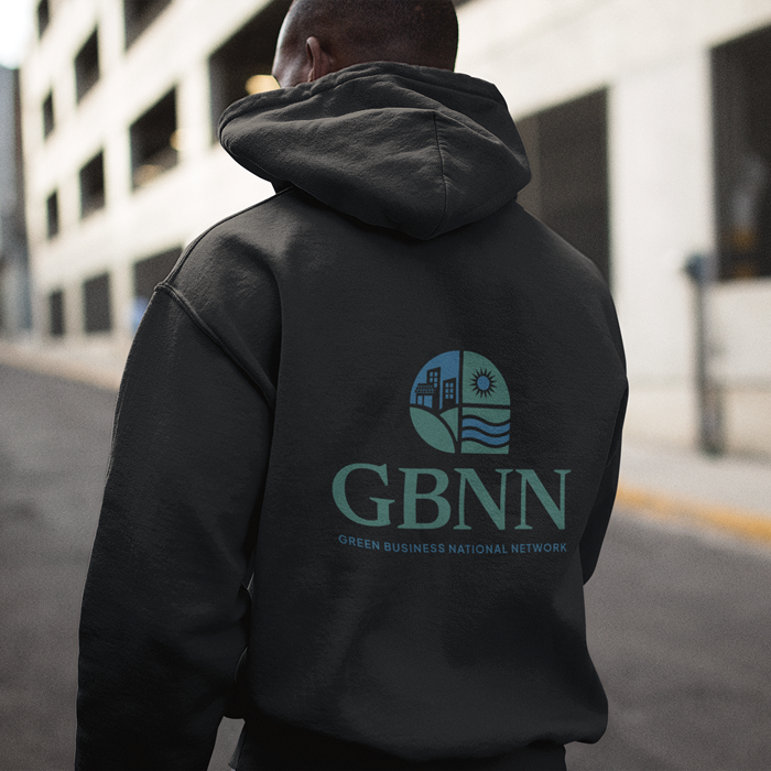
The brand mark also serves two purposes: first, it implies the shape of a capital G, so that in the future the Green Business National Network would become more recognizable just by the icon alone. Secondly, the mark is meant to show the hope we have that tomorrow will be a better future because of the work they are doing to protect our world.
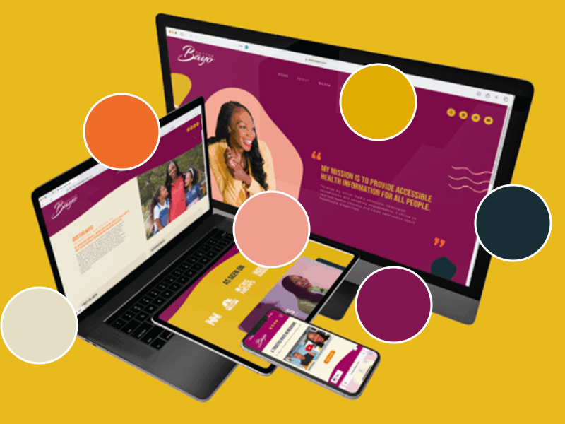
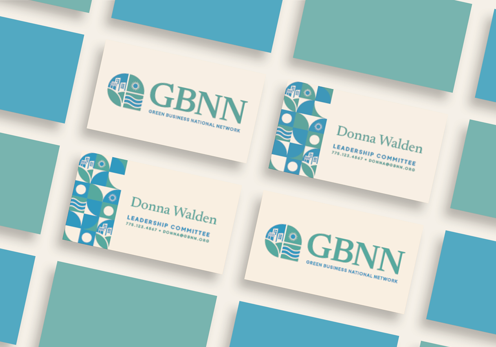
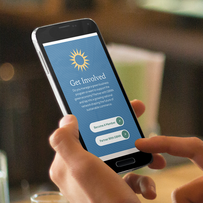
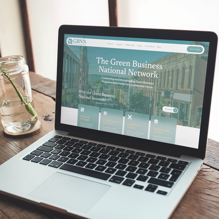
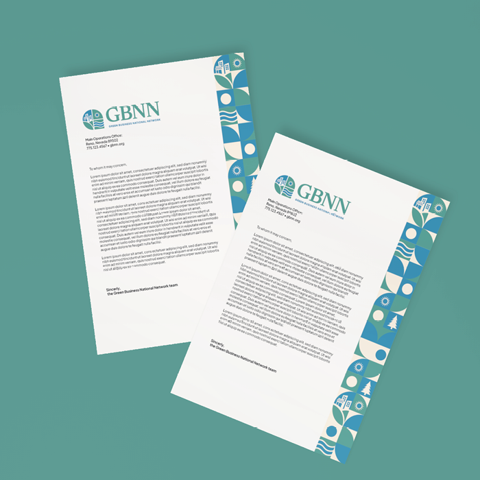
Additional project assets included a fully mobilized ADA UX/UI built website, a stationery business kit, a comprehensive brand guide, client design templates, and support graphic assets. Together, the brand set the tone for the organization’s visual mission, providing a mature, scalable design that can grow with the company and does not feel pretentious or trendy, but rather approachable, inclusive, and educated.
Ultimately, the brand mark serves as a reminder for their team and for all of us to keep putting in the work to support one another, so that we can hope for a brighter future we can be proud of, because we did the work together.