Celebrating and Honoring the Cultural Identity Behind Malayá
Our partnership with Malayá was born out of love literally.
Back in September 2024, our lead designer asked Malayá to cater her wedding, as she wanted authentic Filipino food served to her guests to reflect her and her husband’s love and appreciation for Filipino culture. At the time, Malayá was known only as the food truck, Malayá Eats, and had been in business for about a year.
Initially, the company had established itself with an outside third-party advertising agency and was in process of developing a “quickly sourced” website. But fast-forward a few months, Therese, one of the owners, reached out directly and explained that their website build kept being pushed back, didn’t accurately reflect Malayá’s identity, and that their developer was overpromising and underdelivering.
Many business owners are often tempted by promises of quick results and low costs, but sometimes, those results never materialize. This was exactly Malaya’s experience: they discovered they didn’t have full ownership of their domain, hosting, or the art files for their website. As a seasoned creative agency, Design on Edge is deeply committed to uplifting and supporting small businesses, developing strategies to fit their budget and timeframes. So, when Malayá reached out for help, we knew exactly how to assist. We conducted a thorough site audit, collaborated directly with the third party to ensure a smooth transfer of support, closed the previous account, and set up a new domain and hosting fully owned by the client.
We quickly and thoughtfully built a website that reflected and celebrated Malayá’s Filipino identity, while also developing brand support assets to complement their branding at the time. Each element on their site, from the graphics to the colors to the patterns, was intentionally created to celebrate their identity. From there, they continued to find success while at Reno’s Riverside Farmers Market, catering weddings, and parking their truck at various businesses to offer tasty lunch options. While they continued to deliver delicious, authentic Filipino food and welcoming customer service, much of their success is also credited to their commitment to the community, sourcing from local producers and small businesses to provide true organic ingredients, and growing alongside the neighborhood they serve.
Then, in November of 2025, a beloved German restaurant closed its doors, and Malayá was offered the opportunity to take over the space, plant its roots, and open a brick-and-mortar in the heart of Reno’s Wells Avenue District. Their team reached out to us again and invited us to play a part in developing the space’s aesthetic and refreshing their brand identity in this new chapter.
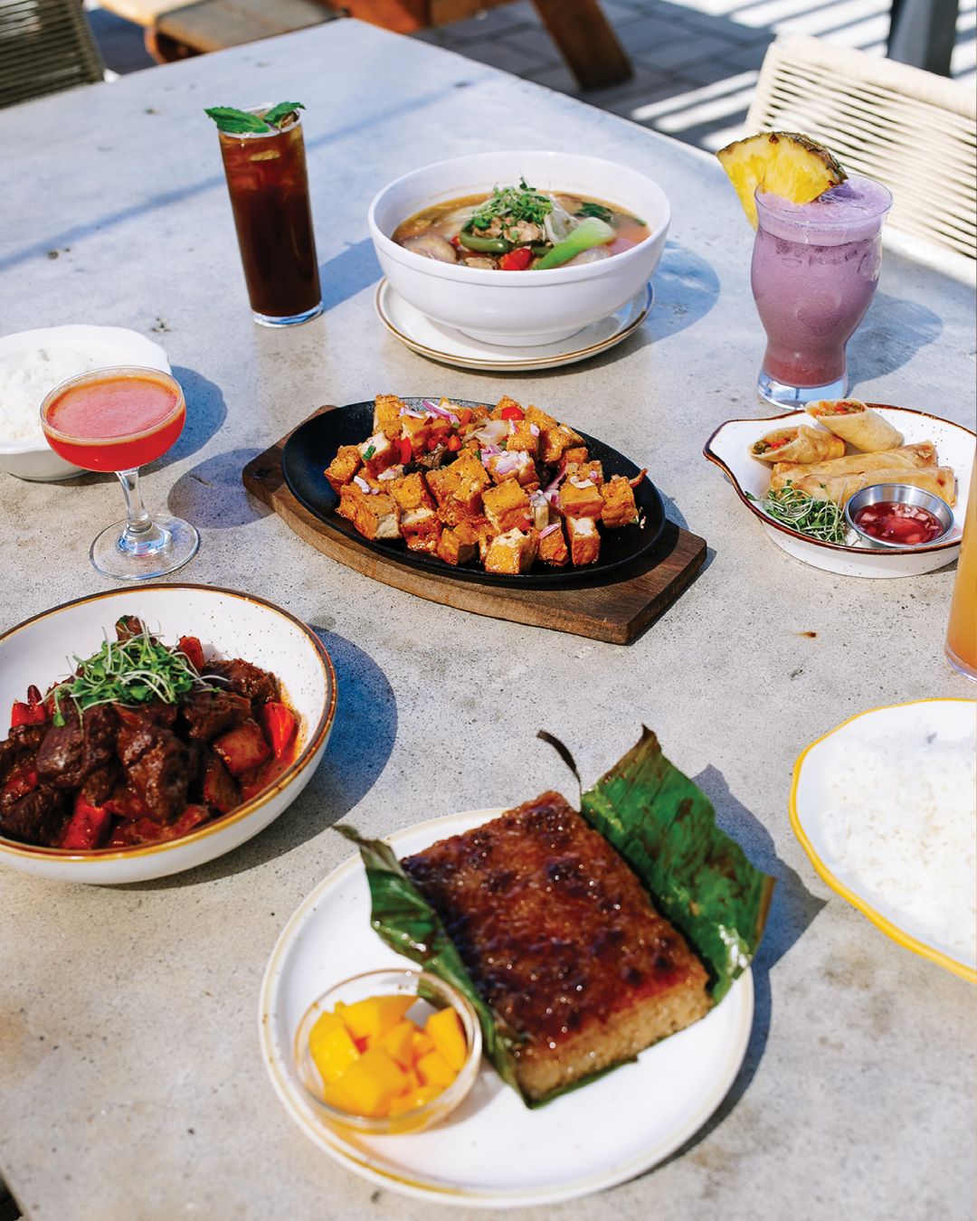
In developing their new aesthetic, we still wanted to incorporate elements from their previous logo so as to show the community that even though they’re entering this new, exciting chapter their mission and vision remain the same: to enhance the culinary landscape of the community by elevating classic and contemporary Filipino dishes, using thoughtful, high-quality ingredients, and providing a memorable dining experience. From the thoughtfulness of their dishes to their hospitable character, they are dedicated to sharing their deeply rooted cultural trait, where guests experience the genuine warmth of being treated like family.
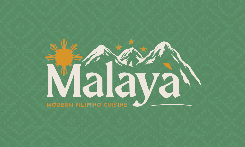
The final brandmark developed for them includes the traditional golden sun and stars from the Philippine flag, with the logo in an updated green as a nod to their original logo. The typeface chosen, Maragsâ, was created by Filipino type designer John David Maza, who developed the font as a love letter to the variety of languages spoken across the Philippines. The illustrated mountain was inspired by Pico De Loro, located in Cavite, Philippines, where the owners, Aren & Therese Normal, grew up together and fell in love as kids.
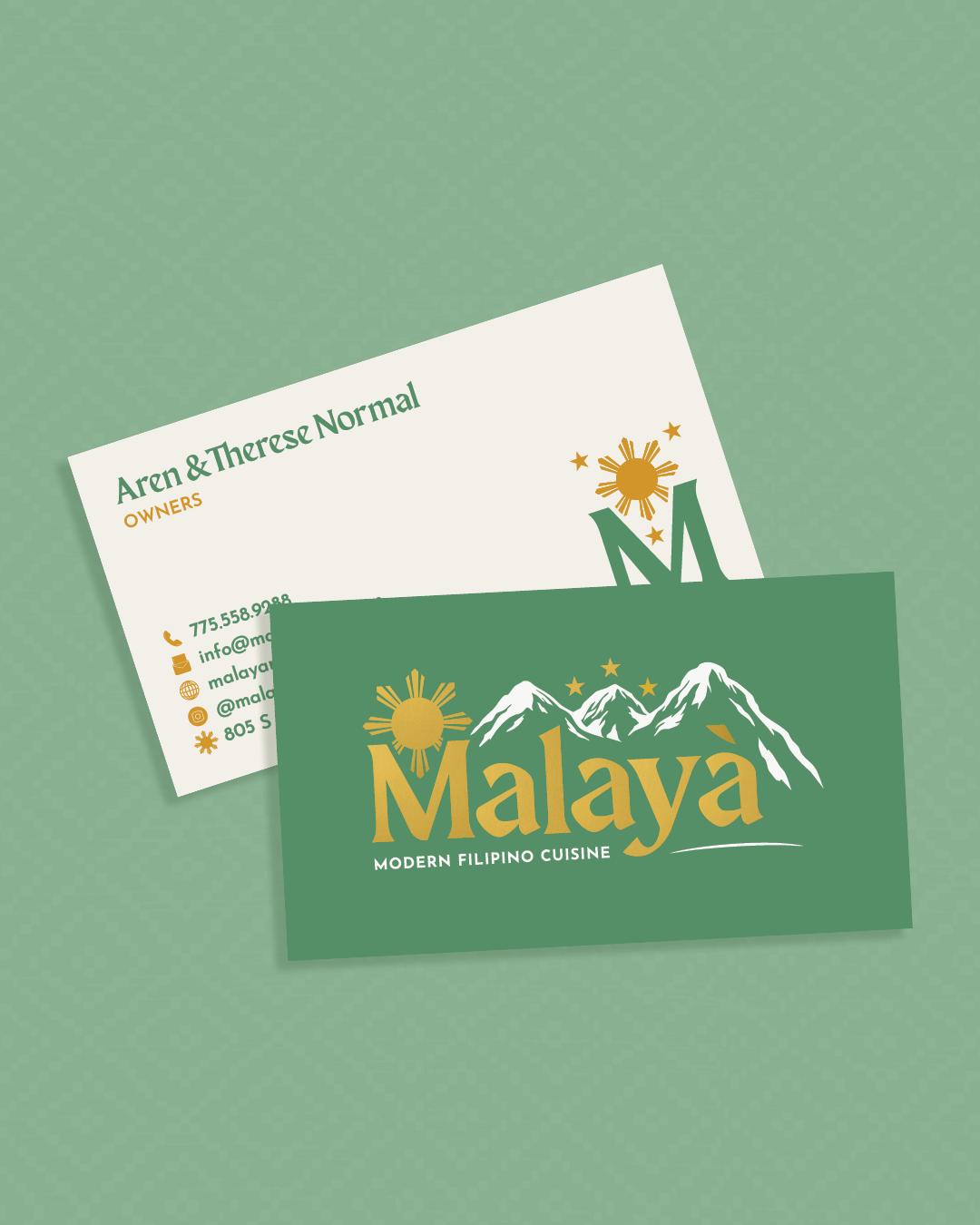
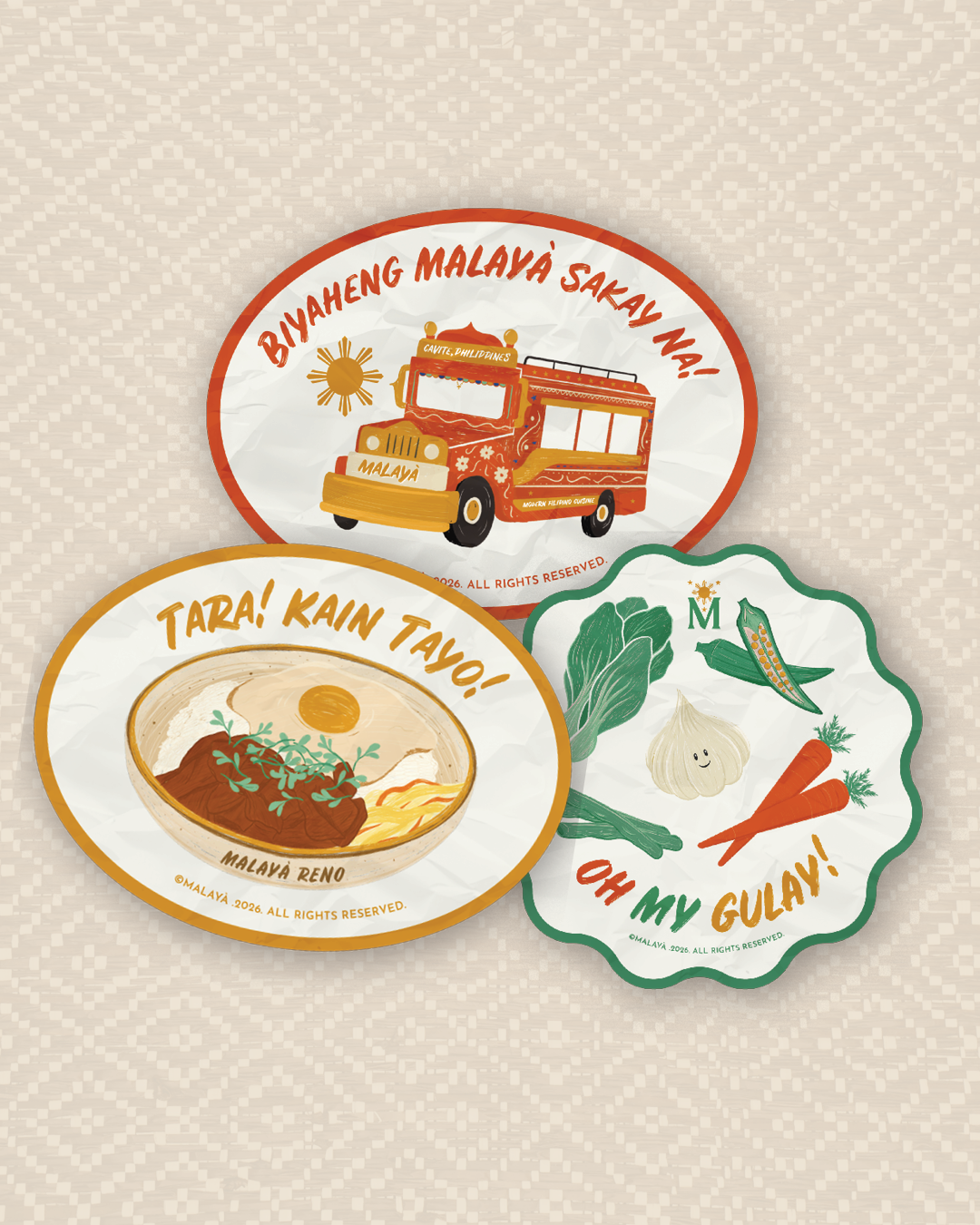
The brand mark is supported by the typeface Rustico, which mimics hand-painted signs found across the Philippines, specifically in sari-sari (variety) stores and jeepneys (redesigned US military jeeps left in the Philippines after WWII, used for transportation). Our team also custom-illustrated banana leaves, jeepneys, and vegetables for support collateral to help further their brand identity.
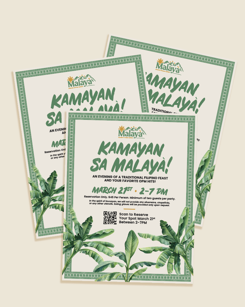
As a full creative team, we have continued to evolve and expand the brand through strategic wayfinding signage, eye-catching directional banners, branded merchandise, and enhanced social media campaigns. In addition, we established an effective email marketing program, supported event promotions, managed public relations outreach, and provided photography and social media content. This journey proves that with a clear brand vision and the right partner, meaningful growth happens. As a creative agency, our efforts not only help grow the brand but also build client confidence in their communications while eliminating the stress of marketing. This allows our clients to focus on what they do best, and together, we all succeed. Today, they proudly support a newly diverse district in their community as a prominent eatery and cultural staple, delighting generations of diners. Today, Malayá is the talk of the town and has become a popular spot for Filipinos craving a taste of home and for those curious about Filipino food.
At Design on Edge, we’re proud to help veteran, minority, and family-owned and operated businesses flourish and elevate their stories with thoughtful and intentional design and illustration.