Exploring Language Through Color in Graphic Design
In the world of design, color is often the first thing people notice–but rarely do they understand the intention behind it. To a designer, color is so much more than decoration–it’s communication, structure, emotion, and language.
For those living outside the world of design, understanding how color works can still transform how branding, layout, and visual storytelling are perceived. It reveals why certain designs feel balanced, while others feel overwhelming, and explains why the most effective visuals are rarely accidental.
At its core, great design is not simply selecting colors based on personal taste; it’s about choosing colors that will resonate with the audience you’re trying to reach.
Color as a Visual Language
Every color carries meaning. Some are bold and attention-grabbing, while others are subtle and grounding. Some create urgency, while others create a sense of calm. When used intentionally, color becomes a way of communication that determines how a message is not only received, but understood–this is why color decisions in branding go far beyond personal preference.
A palette that feels exciting to one person may feel chaotic to another. A color that works beautifully in print may not translate effectively on screen. This is where professional design becomes essential, bridging the gap between aesthetic preference and strategic communication.
Guiding the Eye with Intentional Design
Color plays a critical role in how people move through and interpret a visual composition. Through contrast, placement, and scale, designers guide the viewer’s attention, deciding what’s seen first, what is secondary, and what supports the overall message.
Principles such as the rule of thirds help create balance and focal points, while intentional contrast improves clarity and hierarchy. When used effectively, color reduces confusion and creates a natural visual flow that feels effortless to the viewer.
Emotion, Meaning, and Visual Impact
Color also carries emotional weight. Soft, muted tones can foster a sense of calm, while high-contrast palettes can energize and instill urgency. Thoughtfully selected colors, when paired with intentional imagery, can amplify storytelling and deepen emotional connection with an audience.
It’s not about aesthetics–it’s about shaping how a message feels. When combined with strong composition and visual hierarchy, color becomes one of the most powerful tools for influence and engagement in design.
White as a Design Language
This year’s featured focus is white. While it may appear simple, its power is significant. It creates structure, clarity, and space, allowing everything else to thrive. White creates balance and hierarchy. It enhances readability, and it elevates colors by giving them room to stand out. In many cases, it is the element that makes a design feel refined rather than cluttered.
Just as importantly, white is a form of communication in itself. It can feel modern, minimal, luxurious, clinical, or calm depending on how it is used.
The Power of Negative Space
Closely tied to white is the concept of negative space—often misunderstood as “empty” space. In reality, negative space is an active design element that shapes meaning, forms letters, frames visuals, and defines structure. It gives the eye a place to rest, which in turn makes the overall message easier to process and more impactful. What is not filled is just as important as what is.
Maintaining Cohesion Across Touchpoints
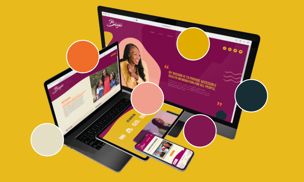
Strong design is not just about individual visuals; it’s about consistency. A cohesive color system across all brand touchpoints is what builds recognition and trust. When colors are used consistently across print, digital, and environmental design, the brand becomes instantly identifiable.
This consistency allows audiences to connect the visual language of a brand to its message more intuitively, strengthening both clarity and recall.
Color Is a Language
Ultimately, color is not just about aesthetics—it’s a language system.
When used thoughtfully, it guides attention, communicates emotion, and reinforces meaning. It shapes how people interpret what they see before they ever read a single word. Understanding this language allows businesses to create more intentional, effective, and emotionally resonant design.
And when that language is used well, the result is not just a beautiful composition—it’s communication that truly connects.