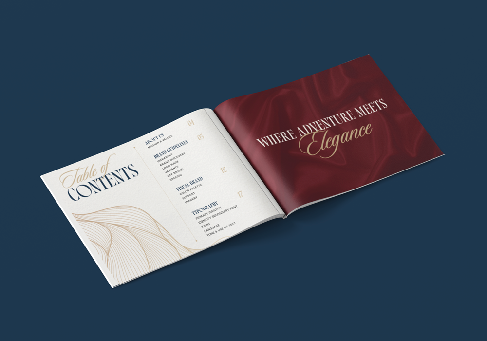
Crafting an Upscale Brand Aesthetic for Luxe Outbound: Where Adventure Meets Elegance
At Design On Edge, we had the exciting opportunity to develop a sophisticated brand identity for Luxe Outbound, a company dedicated to transforming ordinary dates into extraordinary adventures. Merging luxury hospitality, Forbes-level service, and personalized concierge planning, Luxe Outbound crafts unique outdoor experiences that spark connection and excitement—whether that be a mountaintop sunset picnic, a private stargazing retreat, or an adrenaline-fueled day on the water.
Our goal was clear: create an upscale brand aesthetic that embodies elegance and adventure, perfectly reflecting Luxe Outbound’s promise to handle every detail so clients can focus on the moment.
Beginning the Journey: Research and Inspiration
We started by immersing ourselves in the world Luxe Outbound inhabits—the breathtaking Sierra Nevadas. This region inspired a bold and elegant color palette, blending alpine blues with bold jewel tones. This color story evokes the serenity and majesty of nature while maintaining a refined, upscale feel.
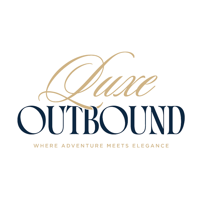
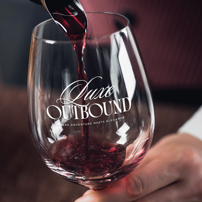
To capture the brand’s dual essence of warmth and sophistication, we paired a calligraphic script for the word “Luxe” with a bold, modern serif for “Outbound.” This combination ensures the logo feels elegant without leaning too feminine—balancing grace with confidence. The script brings a human touch, alluding to the personalized connections Luxe Outbound fosters, while the serif grounds the composition with strength and trustworthiness.
Evoking Emotion: The Mental and Emotional Branding Layers
Branding isn’t purely visual; it’s rooted deeply in what the brand makes people feel and see mentally and emotionally. For Luxe Outbound, key concepts that shaped the direction included:
- Romance and Connection: Sparking heartfelt moments between individuals.
- Adventure and Excitement: Embracing the thrill of unique outdoor experiences.
- Elegance and Warmth: Delivering upscale sophistication infused with humanism.
- Trust and Community: Fostering a welcoming, dependable atmosphere.
The integration of these emotional cues into design choices ensured the brand communicates not just what Luxe Outbound offers, but how those offerings transform lives and relationships.
Building the Visual Identity: Logo, Color, and Support Graphics
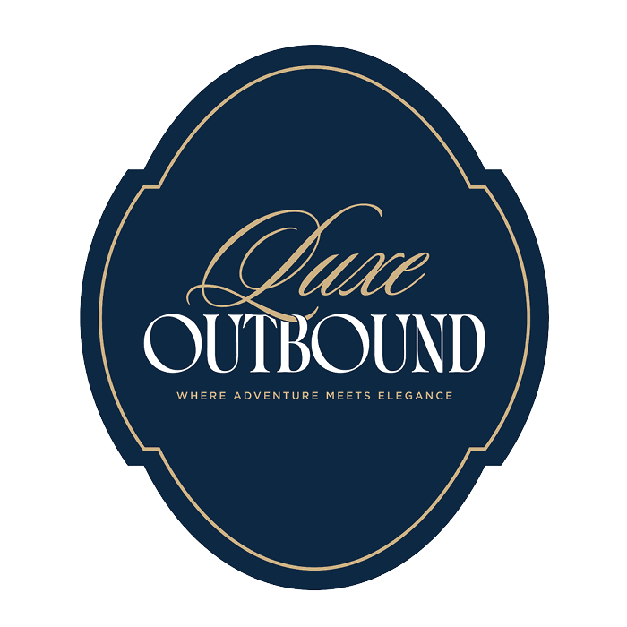
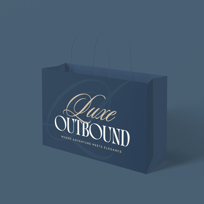
The Luxe Outbound logo serves as the hallmark of their brand. The flowing script “Luxe” paired with the confident serif “Outbound” visually narrates the brand’s promise of curated luxury blended with bold adventures.
The color palette is thoughtfully curated, featuring rich blues, deep greens, jewel tones, and complementary neutrals that evoke romance, nature, and elegant sophistication.
To extend this identity across collateral, we created supporting patterns and graphics inspired by the organic forms of the logo. These elements bring texture and versatility to the brand materials and can be deployed in black, white, or the full brand palette at varying opacities depending on the use case. This flexibility allows Luxe Outbound’s brand to feel dynamic yet cohesive.
The Power of Imagery and Texture
Imagery plays a pivotal role in Luxe Outbound’s brand experience. We recommend incorporating textures and tactile visuals—such as velvet, marble, silk, canvas, water, and oil paintings—to subtly emphasize the multi-sensory nature of their curated outdoor adventures. These materials evoke richness and intimacy, aligning perfectly with the brand’s mission of meaningful, memorable experiences.
Photography for Luxe Outbound centers on warm, romantic, and connection-focused moments that spark curiosity and excitement. These visuals enhance the story, drawing viewers in emotionally while maintaining a polished, high-end look.
Typography: Purpose-Driven and Elegant
Typography choices further elevate Luxe Outbound’s aesthetic. Each typeface is selected for a distinct role:
- Calligraphic script for warmth and human connection
- High-contrast modern serif for elegance and authority
- Additional complementary fonts support versatility across digital and print materials.
Together, these typography families reinforce the brand’s dynamic personality—sophisticated yet inviting.
Conclusion
Designing Luxe Outbound’s brand aesthetic was a rewarding journey of blending the thrill of outdoor adventure with the finesse of luxury hospitality. Through carefully chosen colors, typography, imagery, and graphic elements, we helped craft a brand that doesn’t just promote services—it tells a story of elevated connections, unforgettable experiences, and timeless elegance.
If you’re looking to create a compelling brand that balances authenticity with upscale appeal, connect with the experts at Design On Edge. Let’s transform your vision into a powerful identity that captivates your audience and fuels lasting growth.