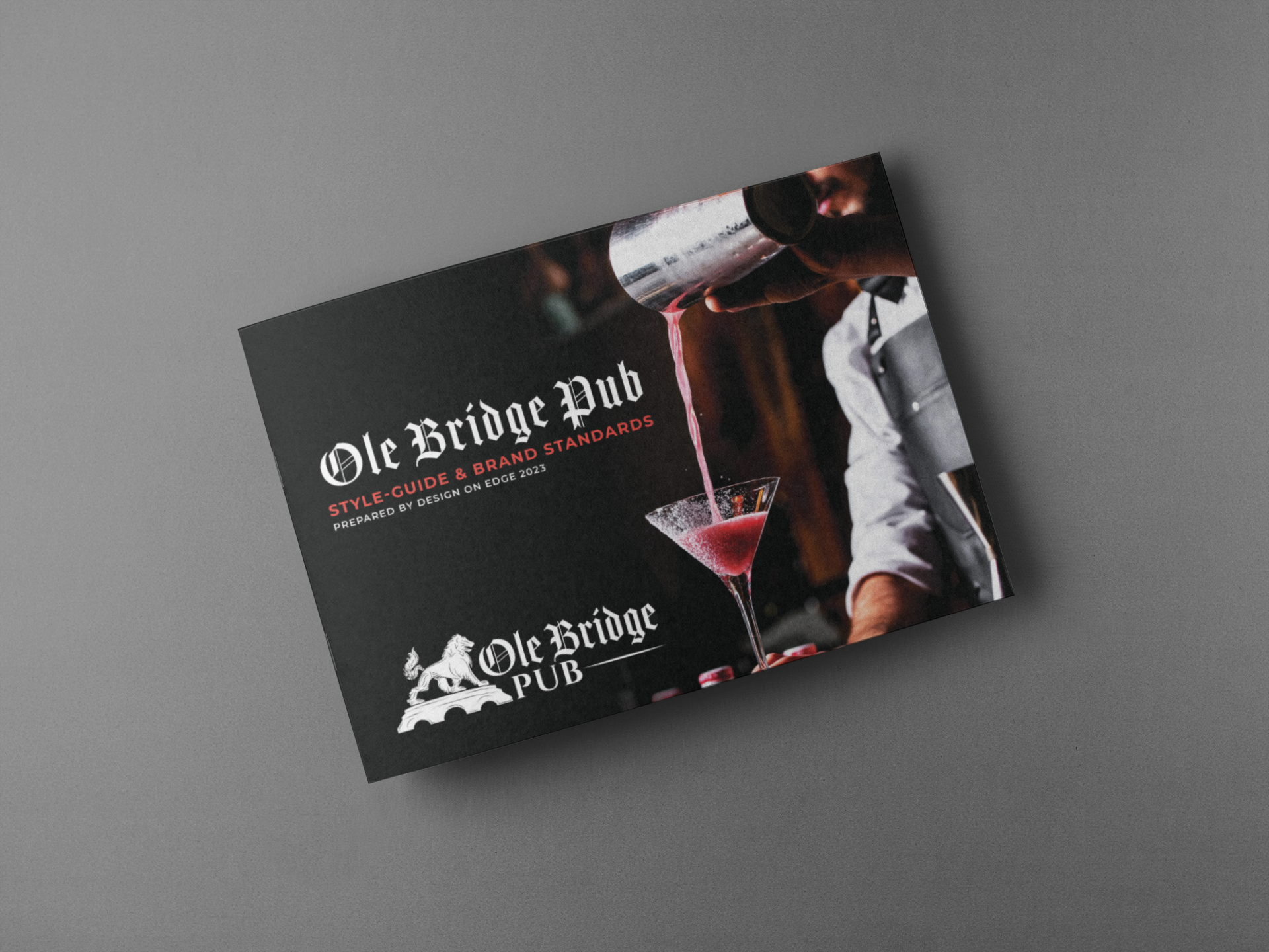
Ole Bridge Pub – Reno’s Community Ale House
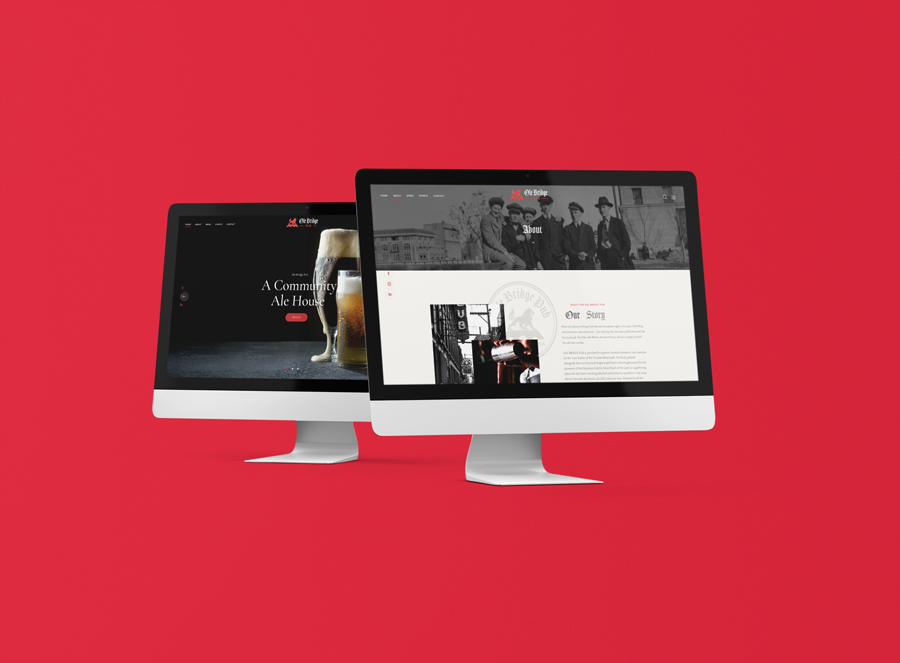
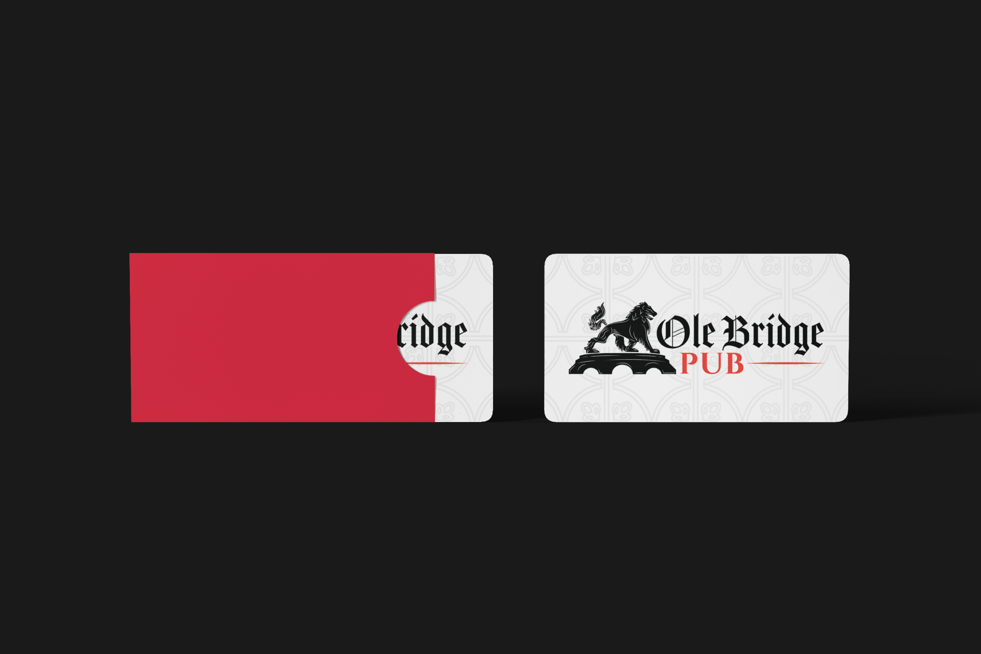
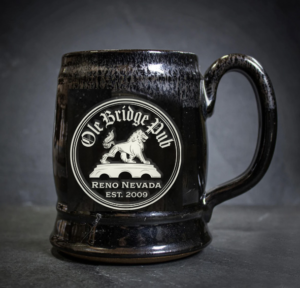
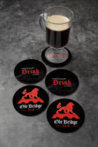
There are plenty of things that Nevada has gotten right in the past: Gambling, entertainment, and adventure … but nothing that has been perfected quite like the local pub. We had the opportunity to provide a brand refresh on the logo and the website for Ole Bridge Pub, along with a comprehensive style guide, gift cards, and merchandise. We brightened the colors and updated the visuals with a custom-illustrated lion and a more modern typeface. Pair this pub and its iconic location with Reno’s diverse history; you’ve got yourself the ultimate combo.
Ole Bridge Pub is perched in a prime location between two eateries on the river banks of the Truckee Riverwalk. Perfectly poised alongside Reno’s historical Virginia and Sierra Street gateways for the pioneers of the fabulous Gold & Silver Rush of the past to a gathering place for the hard-working laborers and industry workers in the area, Reno’s favorite ale house can tell a story or two. Steeped in all the nostalgia and history, the past brings with it.
This public house is a must-see as a popular drinking spot for locals and travelers bye. Ole Bridge Pub offers patrons a cozy, executive setting with expansive riverside views, outdoor seating, a top-shelf cocktails list, whiskey, wine, and local craft brew if you’re stopping in for a quick nip or simply enjoying the city with friends, your welcome to celebrate a story or two of your own.
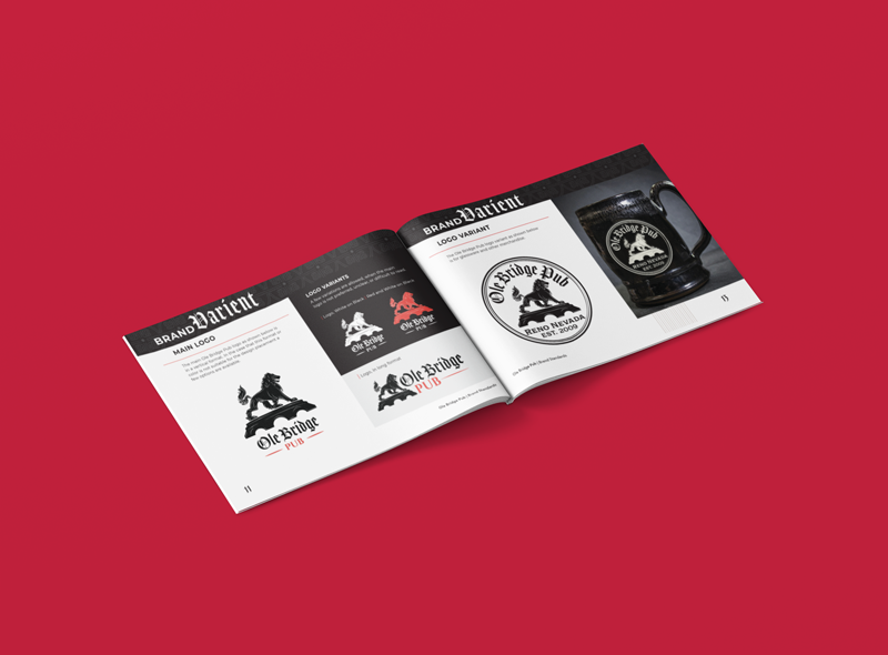
Through several thumbnails and eight unique logos from our designers, Jackal Reyes, Ericha Eberhart, and Rowena Piñero, we landed on the final concept with a couple alternate options for differing mediums:
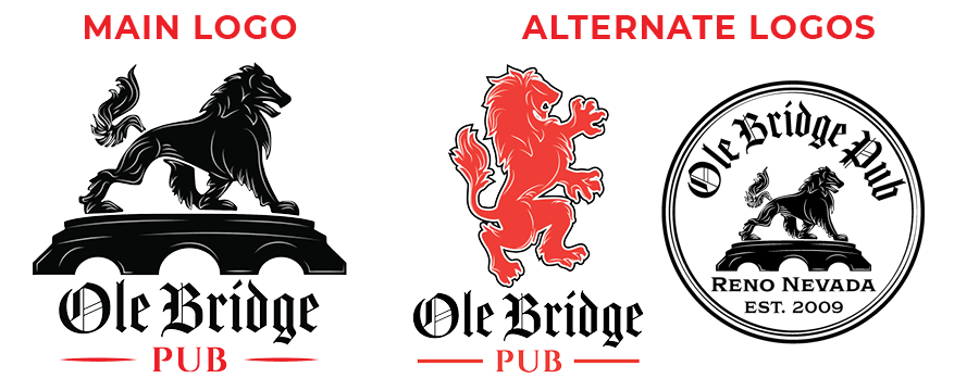
In its stylized representation, the main Ole Bridge Pub logo is the traditional mark of the Ole Bridge Pub brand. The combination mark uses the traditional Lion and bridge with details added to create an more customized visual.
The Lion is the universal symbol of courage, strength, royalty and majesty. Spiritually the Lion symbolizes the message that your greatest power is found deep within the heart; as in the phrase to be “Lion-Hearted. The bridge represents the rich history of the city, and it’s location only a few steps away from where the city began.
With the combination of typefaces the font used in “Ole Bridge“ injects the traditional English style and is modernized by the font of “Pub“.
The brand mark is almost always presented in black and red or white and red when reversed. The icon is always in 100% opacity.


As we continued to develop this mark, we integrated custom illustrations of the UK and Reno, bridging the gap between what was and what is the experience. The brand has elements of old Reno woven into its fabric as not to forget the hard workers who helped develop the foundation of the city we see today.